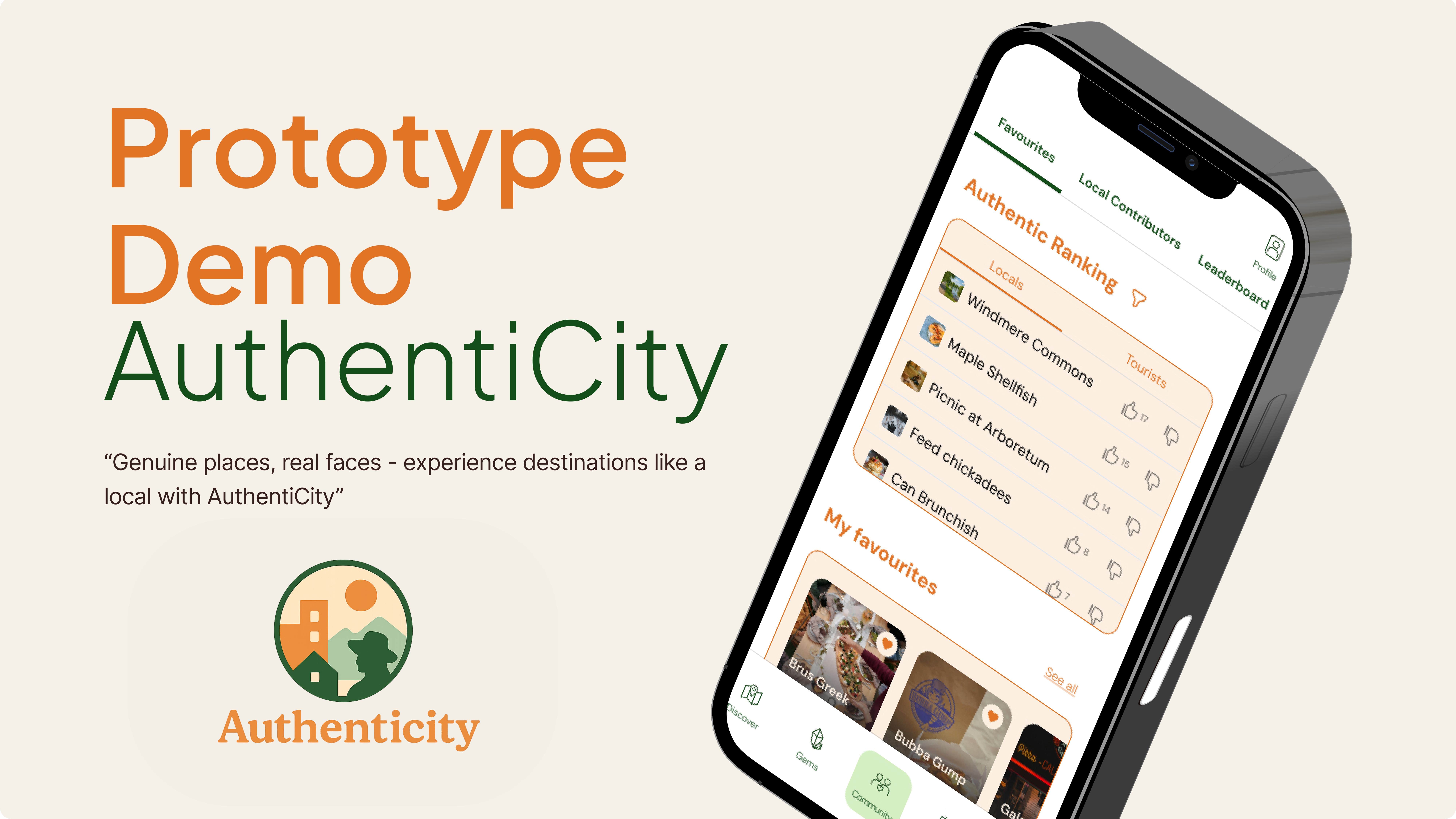
AuthentiCity
Discover real local experiences, not just the tourist trail.
- My role
- Team Lead & product designer
- Timeline
- 2025 / 2 months
- Tools
- Figma, Maze
- Client
- Academic project
- Team
- 6 people
Overview
Problem Statement.
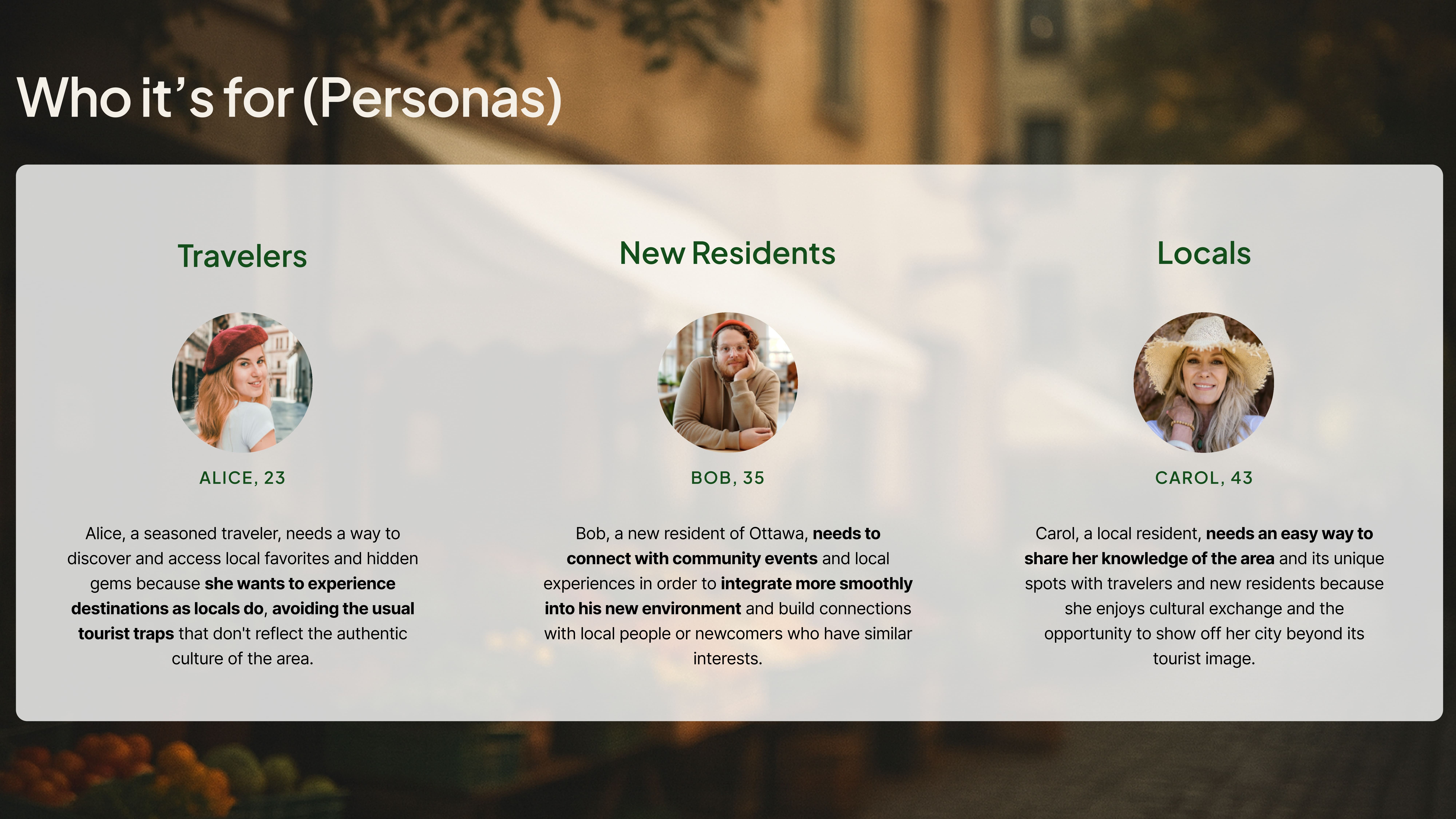
Travelers and new residents in a city/destination, when traveling or in the few months after moving, often struggle to discover non-touristic places and local experiences. Whether they are alone or in small groups, these individuals seek to engage with the culture of their temporary or new home by exploring lesser-known spots, natural hangouts, tasting local cuisines, and participating in activities favored by residents. However, their lack of local connections and knowledge about the area frequently leads them to miss out on authentic experiences, compelling them to settle for mainstream, tourist-heavy options. This makes it challenging to truly experience the everyday life and unique culture of the place, diminishing the overall quality and depth of their travel or relocation experience.
Outcome.
A high-fidelity prototype that:
- lets people browse Locals and Travelers perspectives (dual ratings/leaderboards),
- centralizes community‑posted recommendations, events, and deals (opt‑in),
- and exposes clear patterns for saving, filtering, and reputation (badges).
Scope and constraints.
Course timeline; limited Maze sample; mobile + tablet only; and intentionally not built yet: the full Discover page, a complete “travel buddy” feature, broader verification/moderation, and several secondary screens.
Research
Methods & Sample.
- 14-response survey (10 questions) across travelers, newcomers, and locals.
- 1 focus group (5 participants).
Top 3 insights → Decisions.
Through surveys and research, we uncovered key pain points in the existing traveling and experience apps.
📍 People want the real local stuff — but still value some landmarks.
We introduced dual perspectives: Locals and Travelers (dual ratings/leaderboards), so people can choose an authentic path or a more touristic one per moment.
😵💫 Existing apps feel generic and unreliable; users want an all‑in‑one, community‑driven source.
We emphasized community‑posted recommendations (profiles + badges) and combined navigation + recommendations + events into one place.
📢 Deals are interesting, but only if users control the noise.
We designed opt‑in Deals & Discounts by category (no pushy promos).
Ideation
Small artifacts that show how ideas started and evolved.
I had some concepts and ideas in my mind, so I ended up sketching some concepts
- Sketch → wireframe progression
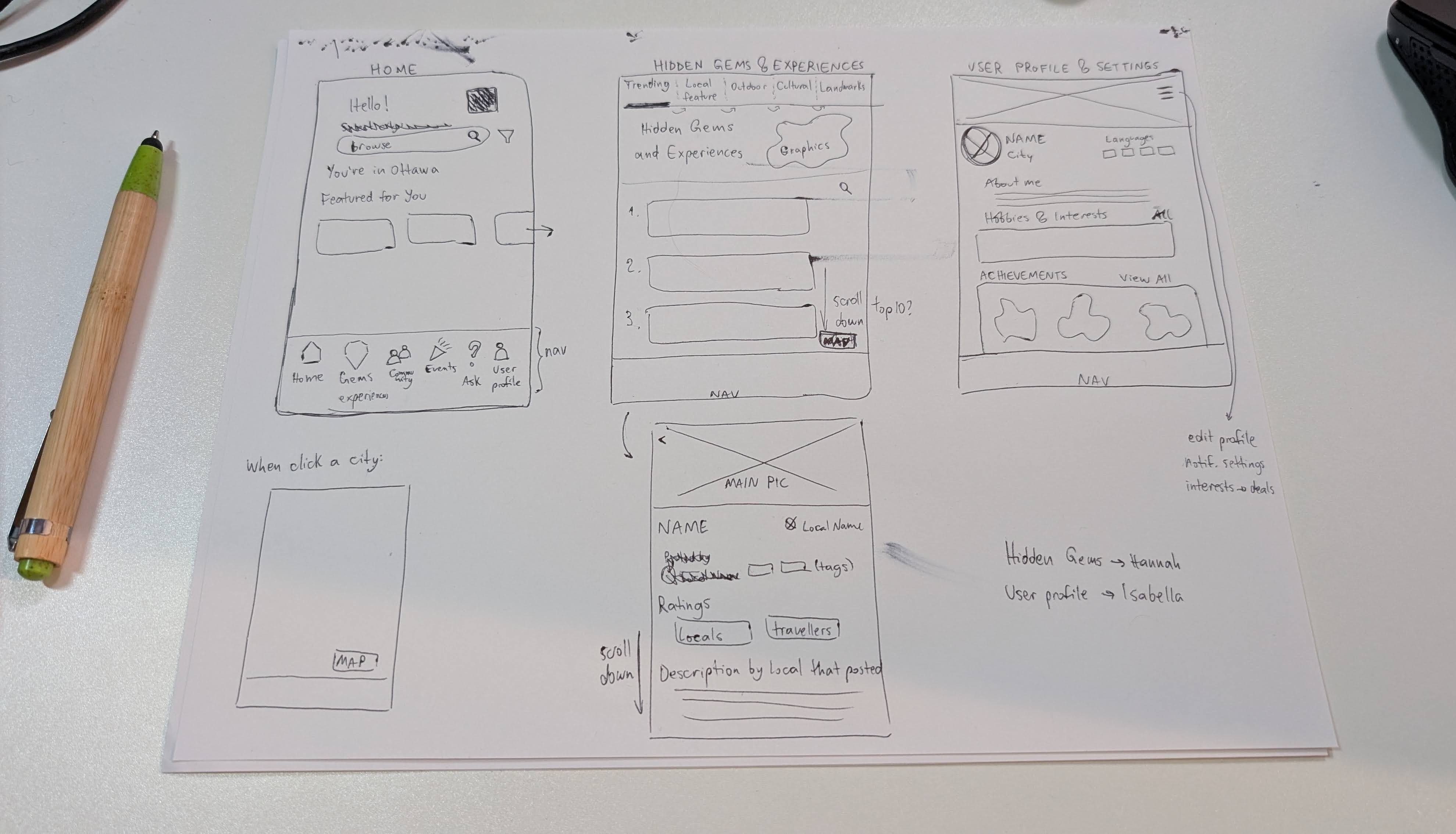
- Concept seeds (from brainstorm & early notes): dual Locals vs Travelers perspectives; Events filtering affordance (horizontal chips with a visible peek); Community tab with rankings & Saved; Journey badges reputation model.
Information Architecture
App Flow.
The app is organized for browse first, contribute second: Gems, Community, Events, Connect, and Profile, with opt‑in Deals and Badges layered in. Bottom navigation keeps entry points thumb‑reachable; horizontal chips or filter icons provide secondary filters, and a subtle peek hints at side‑scroll (from testing). The dual Locals / Travelers lens is built into Community so users can switch perspectives without losing context, and access levels ladder from Guest → Signed‑in → Contributor.

Feature user-flows.
Three lightweight flows turn the information architecture into action: post a recommendation, create an event, and set up a profile. I was responsible for creating the flow for Feature 2 (setting up a profile).
Carol's Journey.
As a Local Contributor, Carol moves from curiosity to enthusiasm: she discovers the app, completes a light profile, posts her first recommendation, and sees recognition via badges and engagement. The information architecture supports her by placing contribution entry points in Community, making Locals vs Travelers rankings visible, and providing a clear path to events. Opportunities for v2 include a welcome badge and stronger prompts after the first contribution.
Core flows
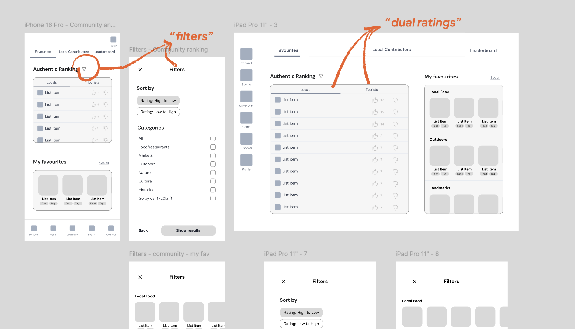
Community — mobile: rankings, filters, saved.
Profile & Settings — tablet: badges + deals.
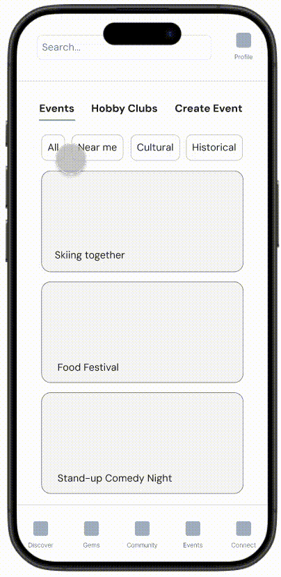
Events — mobile: before vs. after discoverability fix.
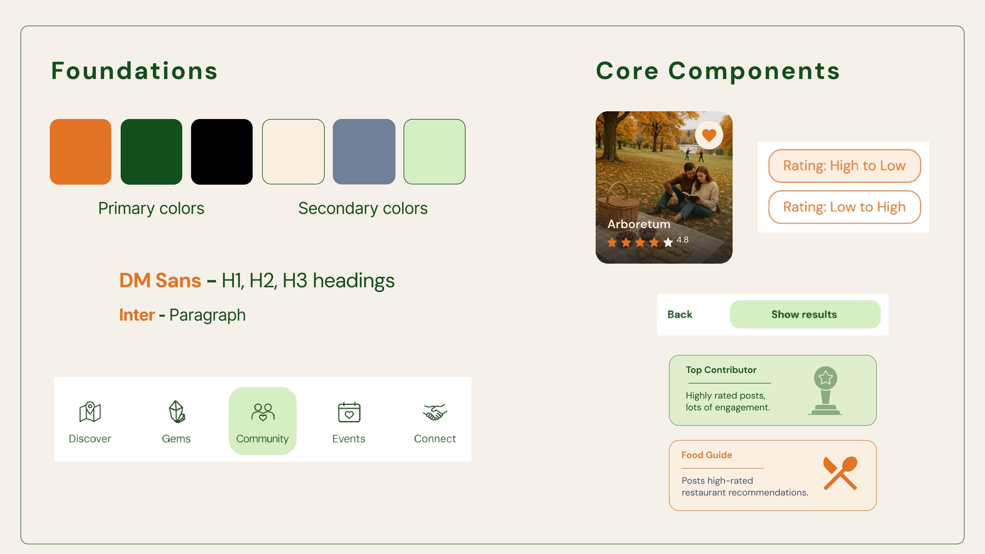
Visual system
- Palette: warm, place‑based tones to feel human and local.
- Type: clear hierarchy that stays readable at mobile sizes.
- Icons: simple, optimistic shapes that support scanning without stealing attention.
Usability testing & iterations (Maze)
Task 1: Find your Journey Badges.
Issue. We had only 50% success in this task. People didn’t know where badges lived.
Iteration. Add a Welcome badge on first run; link Profile → Badges directly; show inline microcopy after the first contribution.
Task 2: How many filters can you find in the Events tab?
Issue. ~40% didn’t notice horizontal chips.
Iteration. Reveal the next chip (peek) to imply side‑scroll; keep chip labels short.
Selected quotes.
Great work! The menus were well labelled and intuitive. There is a nice variety of page layouts that are appropriate to each page. Side scrolling is really nice!
Really great! One idea: consider granting a free badge so new users learn where badges live.
You were the only group to implement an active-tab highlight, and it made navigation immediately clearer — great design instinct on your part.
— Instructor feedback (paraphrased)
Outcome & What I owned
Outcome (v1 prototype). Validated desirability; identified two critical issues (badge findability; events filter discoverability) and shipped targeted UI fixes.
What I owned.
- Concept & problem statement
- App Flow
- User flow (Feature 2)
- Carol's journey
- Community tab
- Lo-/hi-fi direction
What's next
- Onboarding Welcome badge + richer gamification
- Design missing secondary screens
- Complete the Discover page & a map‑first browse option
- Explore a travel buddy system (opt‑in, safety‑minded)
- Verified Local contributors (reputation & safety)