De Luca Hair
Bloom with Style, Flourish with Purpose.
- My role
- Team Lead, Lead Product & Brand Designer
- Timeline
- 2025 / 2 months
- Tools
- Figma, Illustrator, Basecamp
- Project Type
- Academic rebrand & website redesign (Ottawa, ON)
- Team
- 5 people
Overview
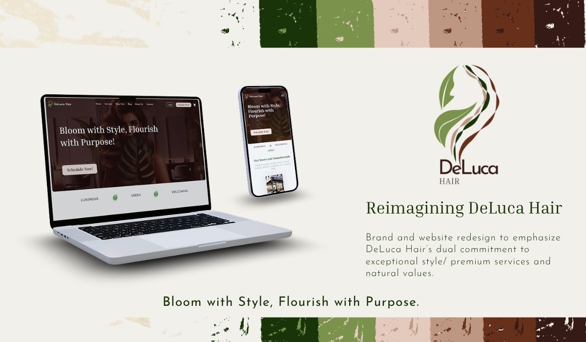
Problem.
The existing De Luca Hair brand & site didn’t express the salon’s premium yet plant‑based, eco‑forward positioning. Navigation was busy (many items led to dead pages), key information (services/pricing) was hard to scan, and the colour scheme was poor.
Outcome.
A cohesive brand refresh and responsive website prototype that:
- clarifies positioning (luxury × nature) through tone, color, and typography,
- streamlines IA and elevates booking and product exploration with lightweight overlays (desktop),
- and presents services, prices, and story clearly across mobile & tablet & desktop.
Scope and constraints.
Academic timeline; solo build for all prototypes; no live development; desktop overlays for product; some artifacts (brand guidelines) intentionally trimmed for clarity in this case study; and intentionally not built yet: blog page.
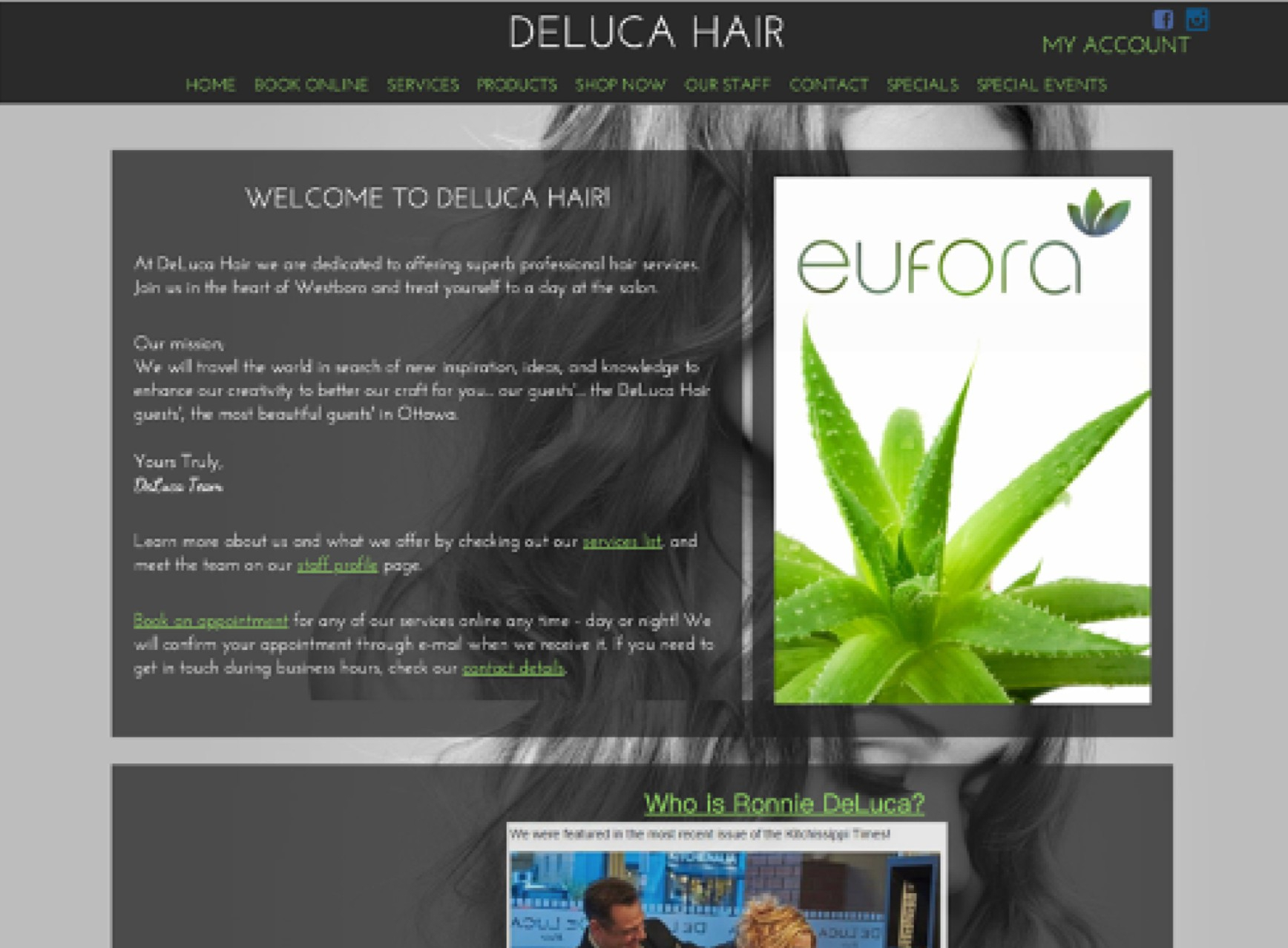
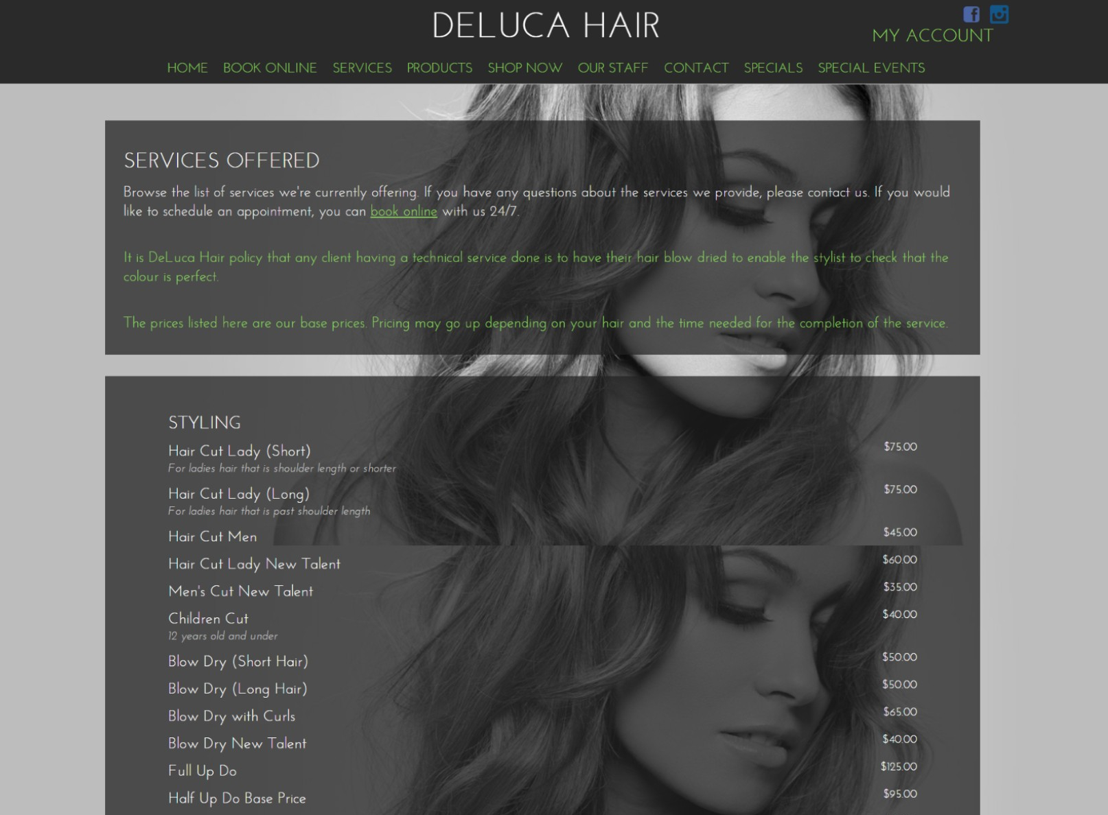
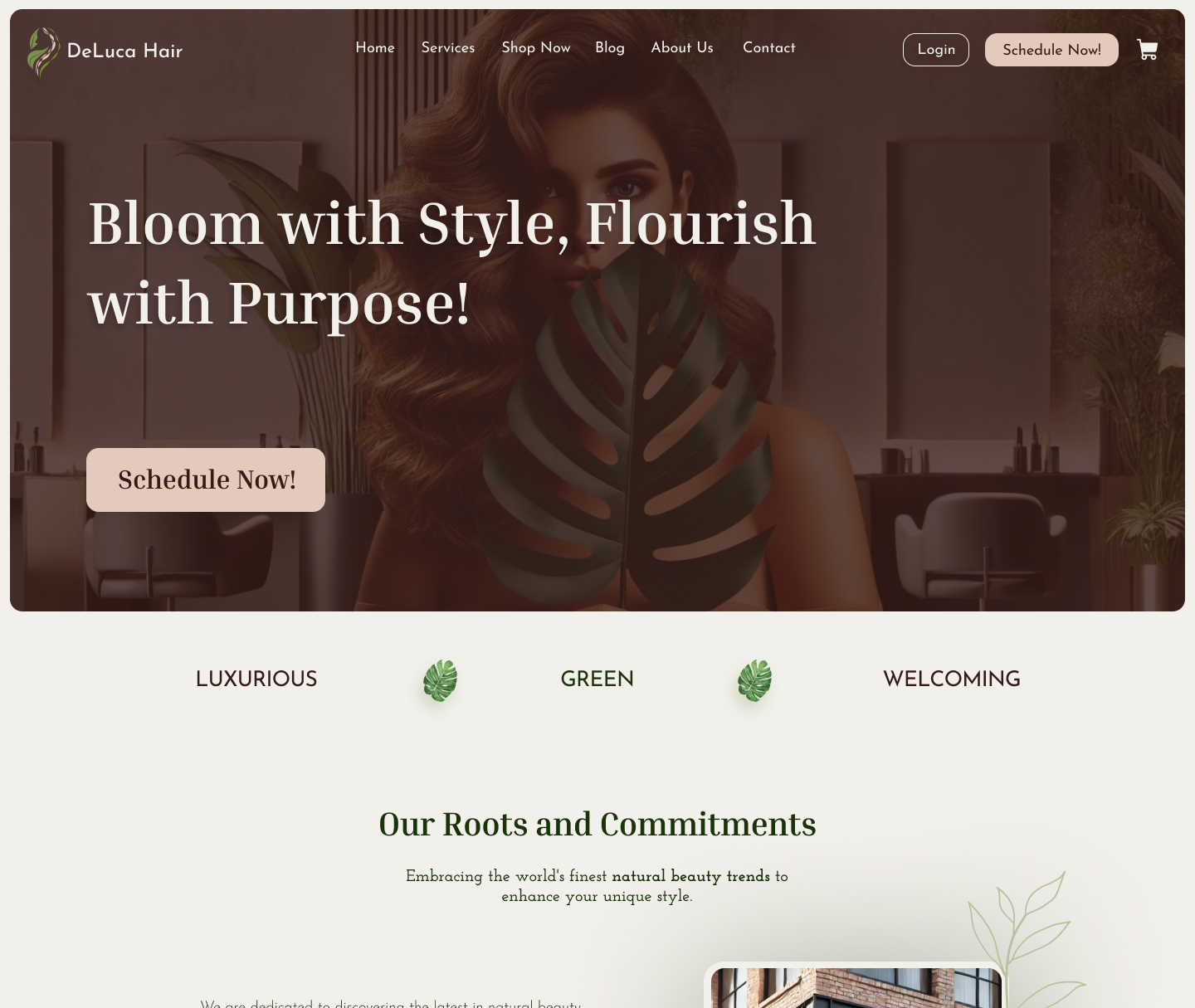
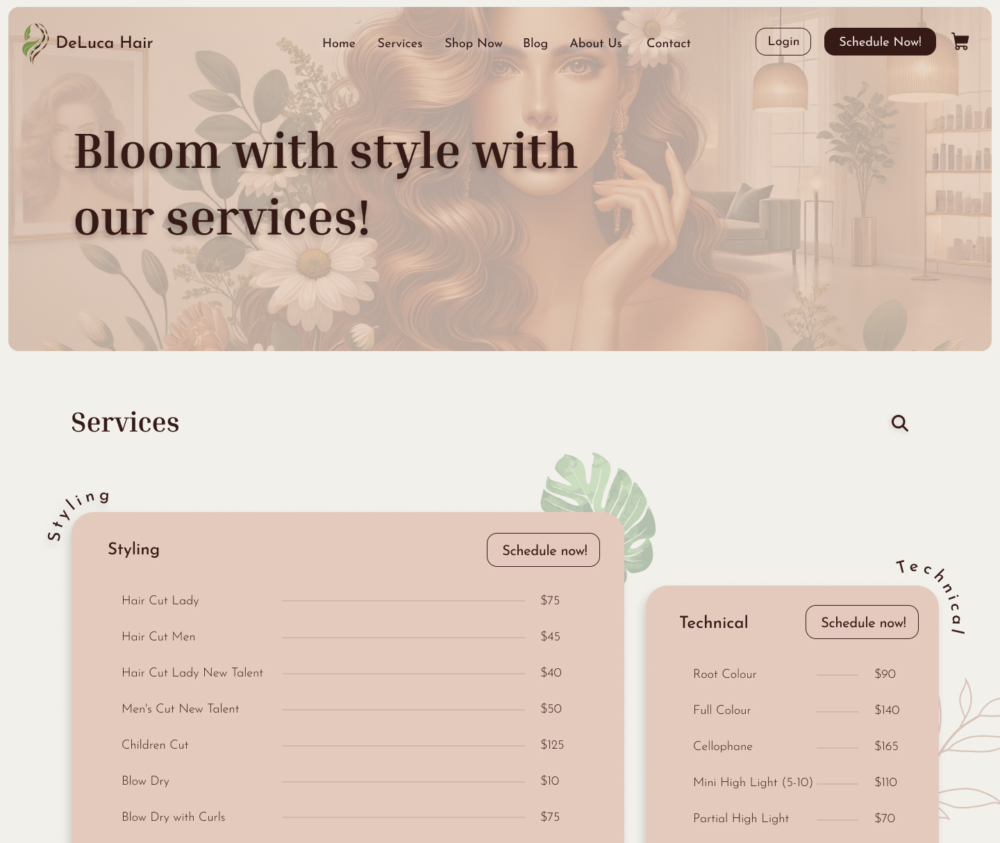
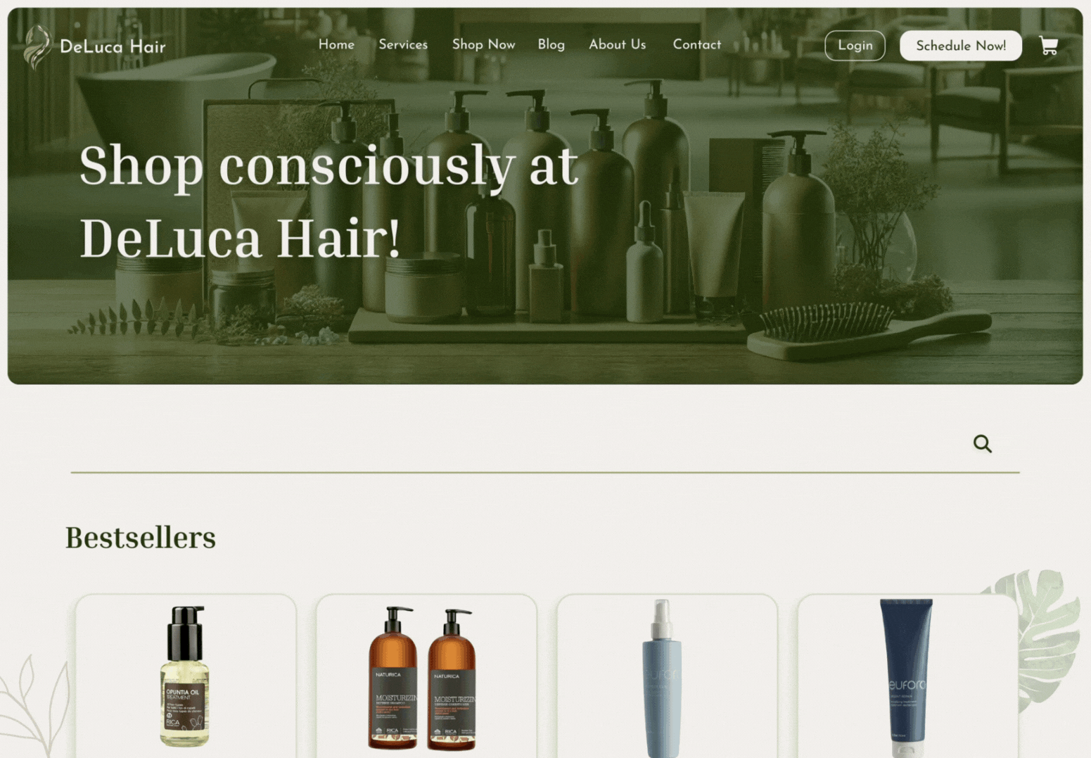
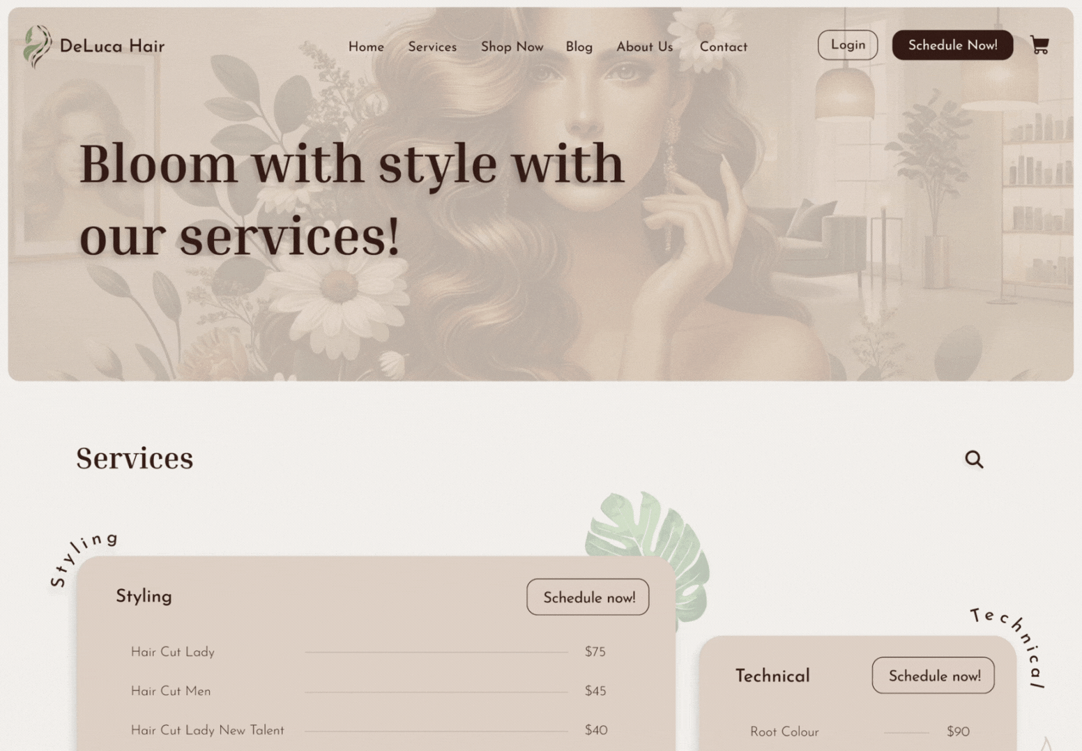
Before → After (Home)
Issues observed: heavy grayscale look; cluttered content blocks; confusing top nav with dead links; services and prices buried.
Changes made: clear hierarchy; persistent Book now CTA; service & price groups readable at a glance; brand story surfaced; warm earth palette supporting luxury × nature.
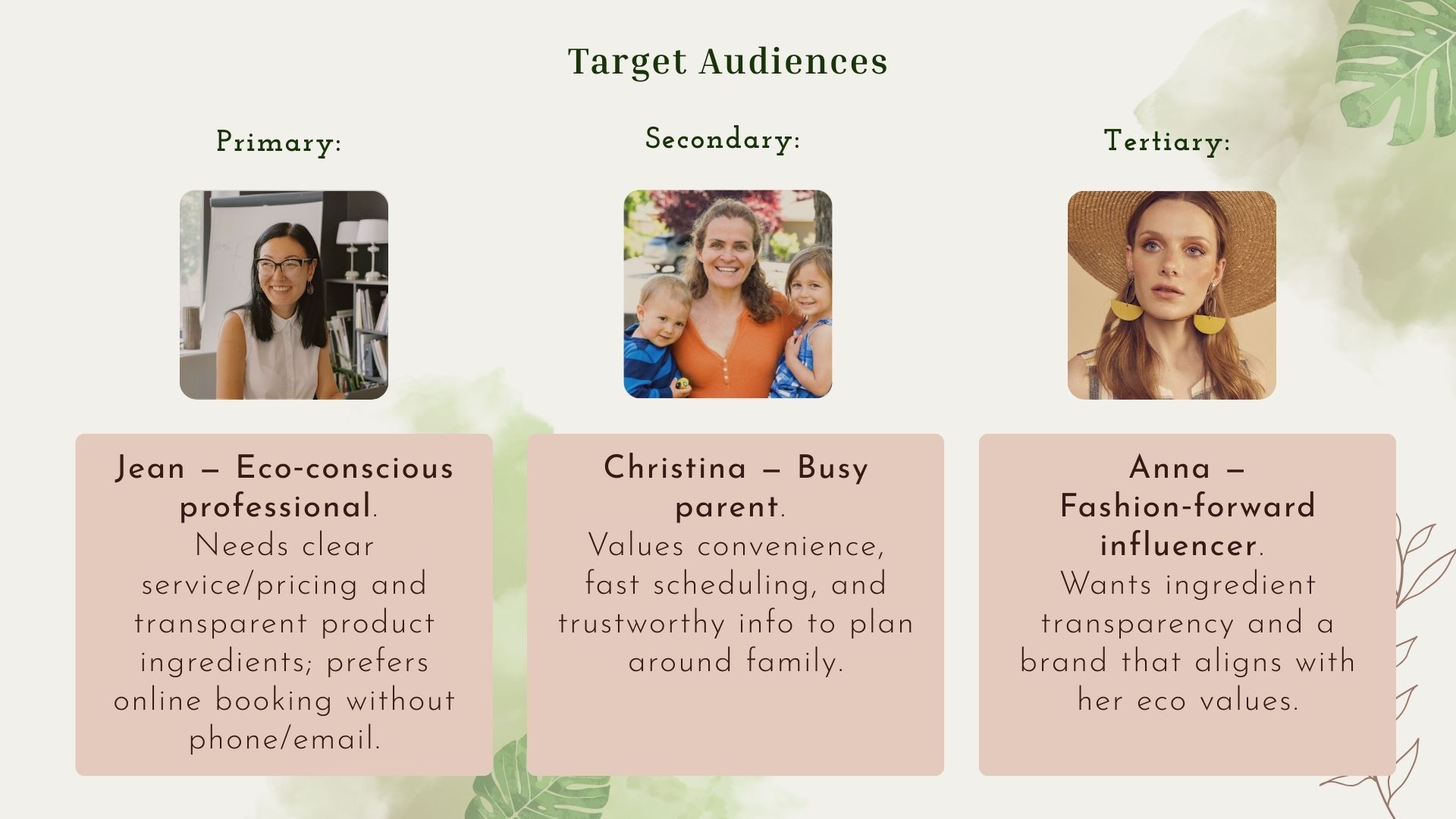
Who it's for.
Through surveys and research, we uncovered key pain points in the existing traveling and experience apps.
Research & Strategy
Inputs. Competitive scan, current‑site audit, personas, moodboard, and a client‑style creative brief.
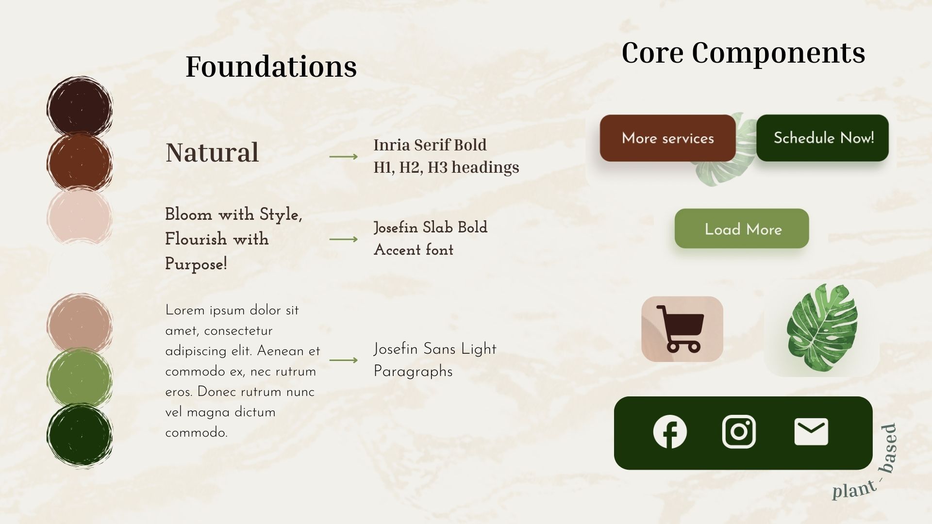
Key message. Bloom with Style, Flourish with Purpose.
Top 3 insights → Decisions.
📅 Booking must be obvious and responsive.
Persistent primary CTA and a simple booking online alternative.
🔎 Ingredient transparency signals trust.
Richer Products detail and educational content blocks.
🌿 Brand needs to speak “luxury × nature”.
Warm earth palette, elegant serif/sans pairing, and spacious layouts.
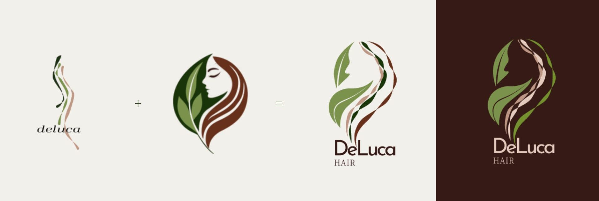
Logo
Goal. Express the balance of style (premium salon craft) and nature (plant‑based, vegan ethos).
Process. Combined two strong drafts into one final mark: a feminine silhouette formed by leaf & strand shapes, adaptable on light/dark backgrounds.
Inputs. Scalable logomark + wordmark that anchors the visual system.
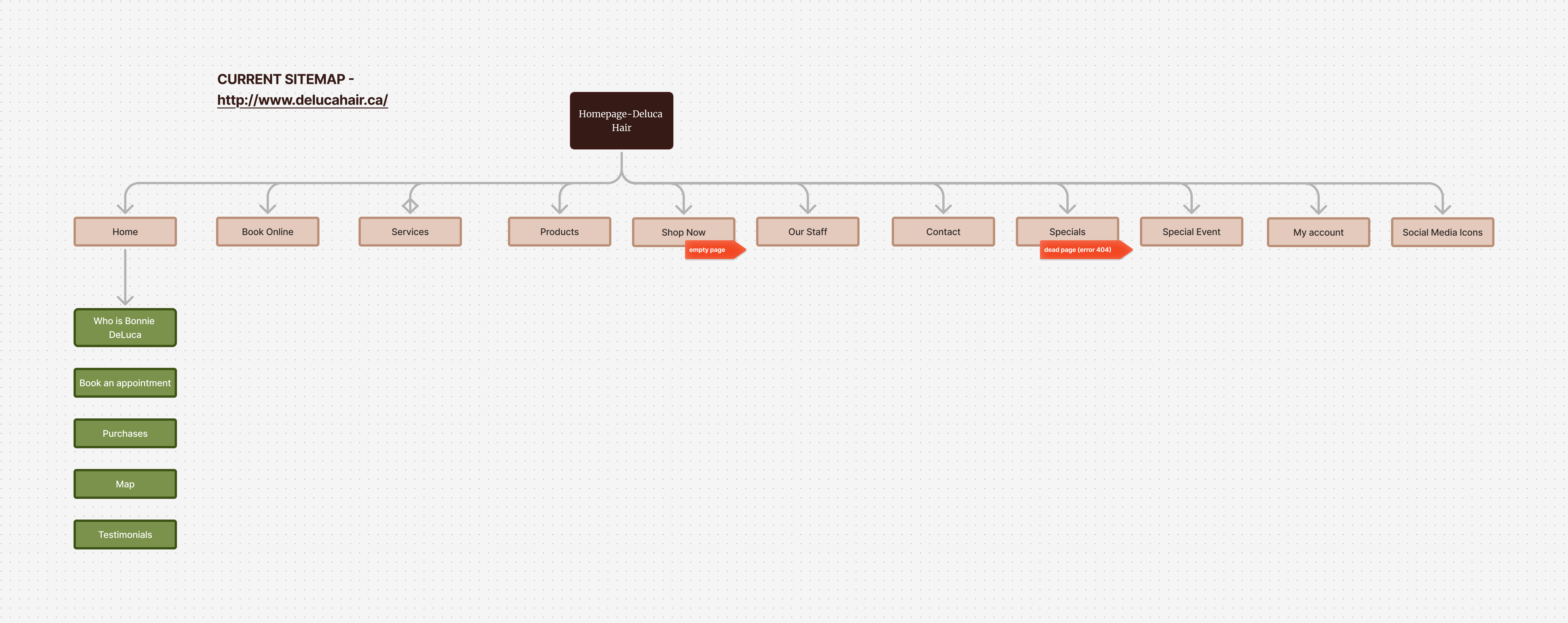
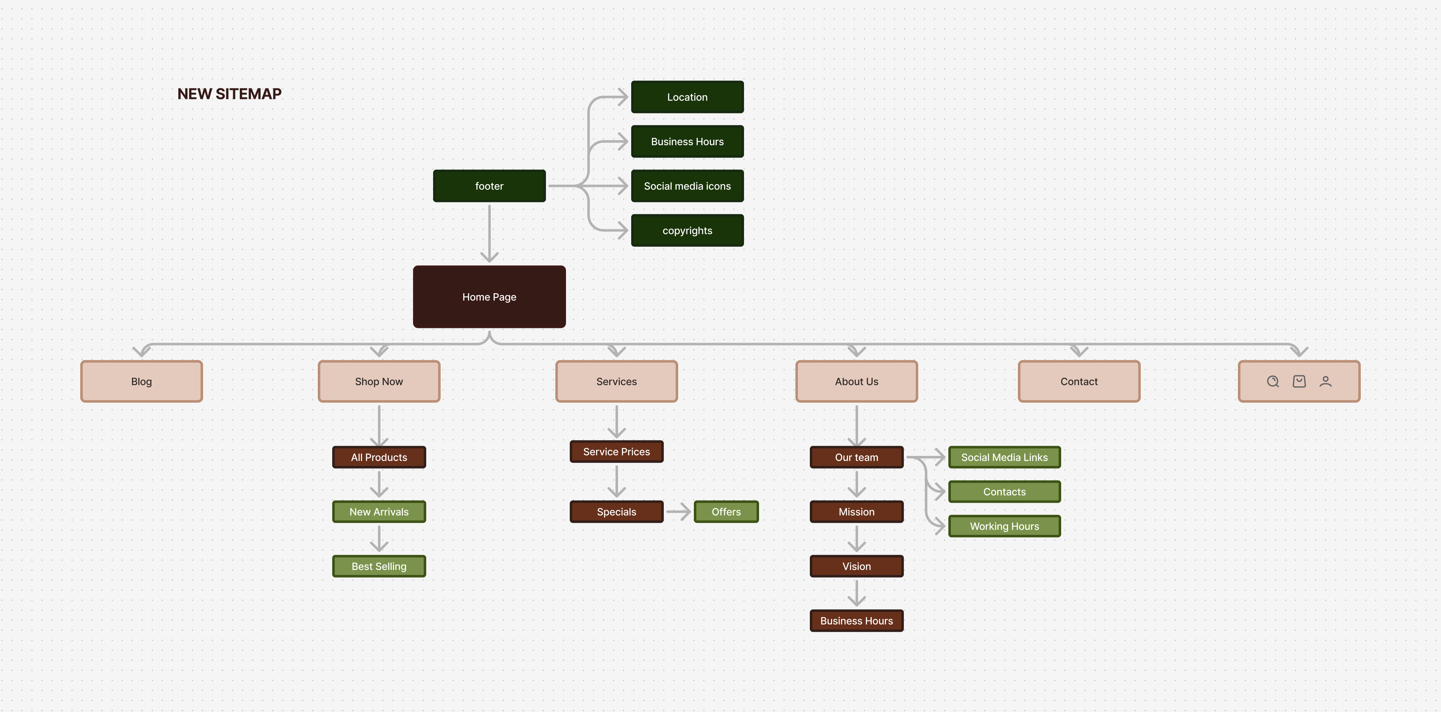
Information Architecture
Sitemap.
The app is organized for browse first, contribute second: Gems, Community, Events, Connect, and Profile, with opt‑in Deals and Badges layered in. Bottom navigation keeps entry points thumb‑reachable; horizontal chips or filter icons provide secondary filters, and a subtle peek hints at side‑scroll (from testing). The dual Locals / Travelers lens is built into Community so users can switch perspectives without losing context, and access levels ladder from Guest → Signed‑in → Contributor.
Core flows
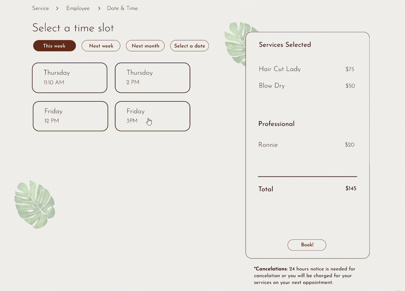
Booking confirmation overlay.
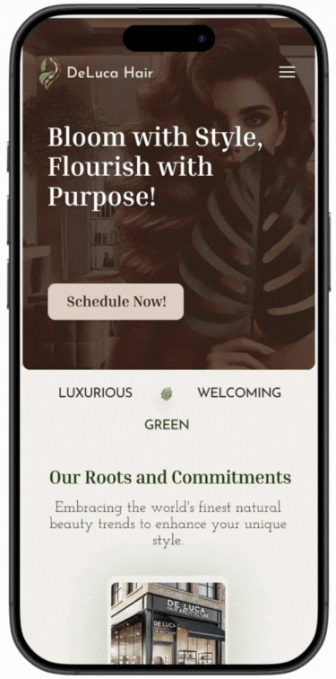
Home navigation on mobile.
Product information overlay.
Services ans price list.
Visual system
- Palette: Earth‑toned palette (deep green, cocoa, sand, cream); note: we dialed saturation up from early trials for vibrancy & contrast.
- Type: Elegant serif for headings paired with modern humanist sans for copy; accessible sizes.
- Icons: Minimal, rounded visual language that stays out of the way of photography.
Collaboration & Process
Weekly client‑style check‑ins (instructor acting as client) to review sitemap, moodboard, logo drafts, and wireframes; each meeting captured action items and approvals in Basecamp with agendas/minutes.
Instructor feedback (highlights).
You were always ready with work each week, and responded well to requested changes. Wireframes are very strong, consistent across all pages, great design elements and balance between text and visuals.
Team work links are complete and organized!
Outcome & What I owned
Outcome (v1 prototype). New branding and logo; high‑fidelity, responsive prototype that aligns brand with values and clarifies paths to book and buy. Logo finalized and ready for a developer handoff.
What I owned.
- Creative Brief
- IA/sitemap
- Lo- and hi-fi prototypes (mobile & destop)
- Overlays (booking/product)
- Final logo creation
- Stakeholder presentations
What's next
- E‑commerce depth: full product pages (reviews, ingredients), cart, and checkout
- Content: Articles hub and richer sustainability education; SEO and schema basics
- Creation of brand guidelines